Top 6 Proven UI/UX Design Practices For User Engagement And Retention In 2026
Many studies show users are unlikely to return after a poor digital experience. That single insight explains why retention-focused UX design is more critical than ever in 2026.
In competitive SaaS, mobile, and eCommerce markets, acquiring users is expensive — but retaining them is what drives profitability. Engagement keeps users active, while retention keeps them loyal. Together, they determine whether your product grows or quietly churns.
This guide breaks down six proven design strategies that increase engagement and long-term retention, backed by behavioral psychology, performance optimization, personalization strategy, and real product metrics. You’ll learn exactly what to measure, what to fix first, and how to validate improvements using cohort data and rapid UX testing.

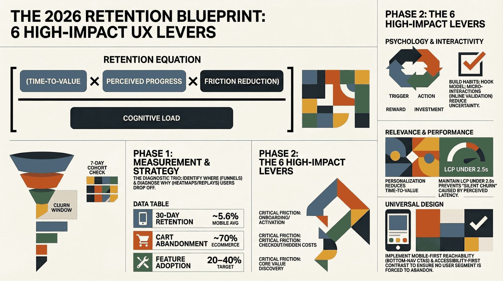
The Retention Equation: A Practical Framework
Over years of product optimization, one pattern becomes clear:
Retention = (Time-to-Value × Perceived Progress × Friction Reduction) ÷ Cognitive Load
If users experience value quickly, see visible progress, and encounter minimal friction — while avoiding overwhelming complexity — they are far more likely to return.
Every strategy in this guide strengthens one or more parts of this equation.
- Habit psychology increases perceived progress
- Micro-interactions reduce friction
- Personalization increases relevance
- Performance optimization reduces cognitive load
- Accessibility expands usable value
- Mobile-first design reduces interruption loss
This framework ensures your retention strategy stays measurable, not abstract.
📌
Highlights
-
✔Engagement and retention reinforce each other.
-
✔Reduce friction and time-to-value before adding features.
-
✔Six high-impact UX levers improve activation, DAU, and cohort retention.
-
✔Measure first using cohorts, funnels, and session replay.
-
✔Each section includes tools, metrics, and a quick test to run this week.
You will get a 5-point checklist to keep users. We include text you can copy and notes from Duolingo and Spotify.
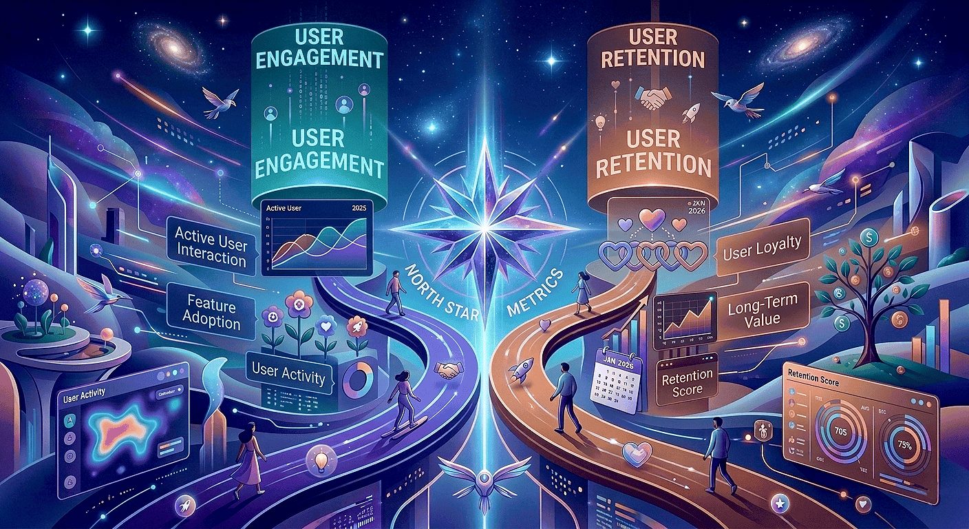
Why Engagement And Retention Are Your North Star Metrics In 2026
Engagement and user retention should guide every product decision in 2026. This reduces acquisition costs and helps users stay longer, giving your team a single, clear goal.
What user retention means for your digital product experience
User retention is the share of users who return and get ongoing value. Improve early sessions and the onboarding journey, and you increase the likelihood of repeat usage while lifting customer lifetime value (CLV).
Why reducing friction beats adding features
Friction appears as confusion, stalled flows, or unclear feedback. These small moments push users away faster than missing features. Reducing complexity and shortening time-to-value often improves retention more than adding new capabilities.
What high-performing teams track and share
- Cohort retention and churn windows to spot when users stop returning.
- Feature adoption and session frequency to connect behaviors to revenue.
- Top drop-off points in the user journey so product, design, analytics, and support can prioritize fixes.
Quick team checklist: Include product, design, analytics, and CS in a weekly 30-minute review. Share a dashboard with cohort charts, top funnel drop-offs, and two prioritized experiments.
Benchmarks And Signals To Watch: What “Good Retention” Looks Like Now
Knowing the right benchmarks helps you spot real problems, not noise.
Use a baseline so your team doesn’t chase normal fluctuations. Industry averages for many consumer mobile apps often fall in the mid-single digits for 30-day retention, though results vary significantly by category and acquisition channel. Don’t guess — evaluate your specific niche before judging performance. Always compare within your product type (SaaS, mobile app, or eCommerce) before declaring success.
E-Commerce Red Flags
Cart abandonment near 70% is widely reported in UX research from Baymard Institute, which consistently identifies checkout friction as a primary cause. Common issues include hidden costs, forced account creation, unclear delivery timelines, and missing trust signals. Prioritizing checkout clarity, transparency, and speed is one of the fastest ways to improve conversions and long-term retention.
Engagement Indicators That Predict Long-Term Returns
- Session frequency: Frequency is the key to retention. If users engage more often, they are more likely to stay. Track weekly and monthly trends closely.
- Feature adoption: Active use of core features often precedes repeat visits—aim for 20–40% adoption on key features where relevant.
- Repeat actions: Saved items and completed actions indicate strong engagement. Track these signals to identify users likely to retain.
| Metric (directional) | Benchmark (2025–26) | What to watch |
|---|---|---|
| 30-day retention rate | ~5.6% (mobile app avg) | Segment by channel, device, and intent before acting |
| Cart abandonment | ~70% (eCommerce) | Fix checkout friction: costs, steps, forced accounts |
| Session frequency | Varies by product type | Track WAU/DAU by cohort |
| Feature adoption | Target 20–40% for key features | Measure task completion and repeat actions |
Practical Takeaway: Benchmarks are directional. Your instrumented product data tells you which flows to fix. Break your data down by acquisition source and user intent. Identify the biggest friction points and address them first. In 2026, speed and personalization drive retention. Iterate on design, then monitor your daily metrics — the data will confirm what works.
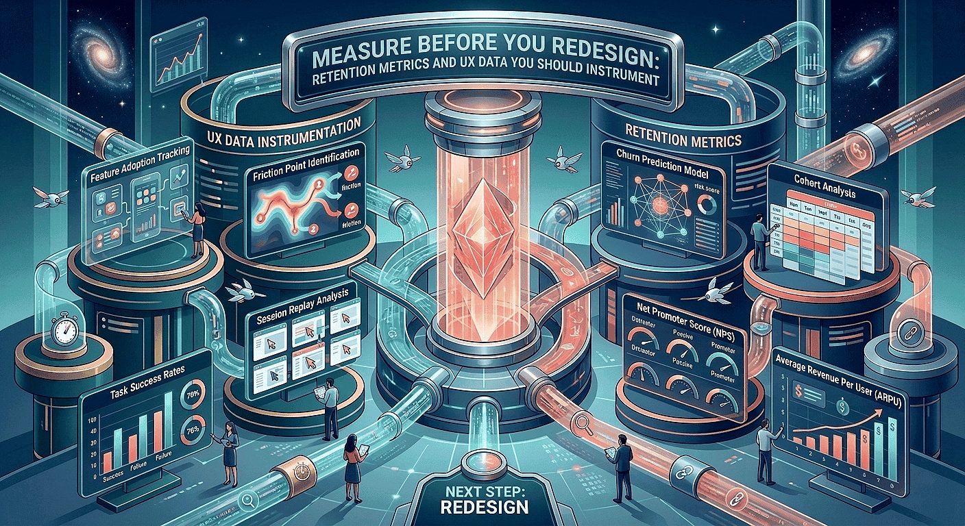
Measure Before You Redesign: Retention Metrics And UX Data You Should Instrument
Before redesigning any interface, validate assumptions with behavioral data. Cohort retention trends, funnel drop-offs, and session diagnostics should guide prioritization — not aesthetic preference alone. A structured UX audit helps identify friction points that directly impact engagement and retention metrics.
Cohort Retention Rate And Where Users Drop In The Journey
And subsequent return moments in the user journey. Cohorts show if a tweak helps the right users at the right time.
Churn Rate, CLV, And What They Reveal
Define churn rate consistently (for example: percentage of users inactive after 30 days). Pair churn with customer lifetime value (CLV) to prioritize fixes that impact revenue. Percentage changes in churn often surface issues faster than raw counts.
Funnels, Heatmaps, And Session Replay To Pinpoint Friction Fast
Funnels show where users drop out, while heatmaps and session replays explain why. Look for “rage clicks” and “misclicks” — strong signals of user frustration. Funnels show where the problem occurs; replays reveal the cause.
“Funnels tell you where; replays tell you why.”
Tools we commonly use: Hotjar for heatmaps and session replays, and LogRocket for session diagnostics as part of our conversion-focused UX audit process. Add quick surveys to capture user feedback before drop-off. Quantitative data shows the problem; qualitative feedback explains the reason.
Priority Instrumentation (Day 0–3)
- Baseline cohort: Instrument account_created and return events to measure 7 & 30-day retention.
- Onboarding steps: Add onboarding_step_completed with step_id and time_to_complete.
- First value: Track first_core_action with feature_id and success flag.
Quick Instrumentation Checklist (Copy And Paste)
Use consistent event names and properties so cohort and funnel queries are reliable across teams.
How To Build A Retention Dashboard Your Team Will Actually Use
Include a cohort chart, top funnel drop-offs, key feature adoption, DAU/WAU/MAU, and segment filters (channel, device, plan). Share it with product, design, analytics, and support on a weekly cadence.
- Instrument: Track key events like sign-ups, payments, and return visits. Use a consistent tracking checklist to ensure reliable data.
- Review: Analyze weekly cohort trends, identify top friction points, and review 1–2 session replay highlights.
Sample cohort SQL (simplified — adapt to your warehouse):
SELECT user_id,
MIN(event_date) AS install_date,
COUNTIF(event=’return_visit’ AND event_date <= install_date + INTERVAL ’30’ DAY) AS returns_30d
FROM events
WHERE event IN (‘account_created’,’return_visit’)
GROUP BY user_id;
Note: Adjust syntax for BigQuery, Snowflake, or Redshift. Add a DAU baseline chart and compare DAU before and after UX changes to link UI work to daily active users. Set alerts for major drops so teams can act quickly.
Quick Wins (Week 1)
- Run a 7-day cohort check and publish baseline numbers (10–60 minutes).
- Instrument inline validation events on one high-traffic form to reduce drop-offs.
- Capture 10 session replays for a prioritized funnel and review 1–2 in your weekly meeting.
Make data the shared goal: When teams use the same dashboard, improving user retention becomes a joint outcome, not a blame game. It works with any data tool and provides everything needed to start your first review immediately.
User Psychology That Builds Habits And Loyalty
Small, repeatable moments shape habits. Align those moments with clear goals to make loyalty more automatic.
The Hook Model, popularized in Hooked by Nir Eyal, explains how products build habits through four stages: trigger, action, variable reward, and investment. When applied ethically, this loop reinforces progress and personal investment rather than manipulation. Introduce a trigger, guide the action, follow with a variable reward, then request a small investment. This cycle encourages users to return because they find value — building habits that last.
UX Strategies For User Retention
Three psychology-based tactics to test this week, with what to measure for each:
Trigger before signup — Let users try a core action immediately.
What to measure: Activation rate within the first session.
How to instrument: Track onboarding_step_completed and first_core_action.
Time: 60 minutes to prototype.
Variable micro-rewards — Give small, unexpected rewards after completion.
What to measure: Repeat action rate and day-7 retention.
How to instrument: Track feature_used with repeat_count and feedback_submitted.
Time: 2–3 hours to draft microcopy & prototype.
Small investments — Let users save a template or preference. When users invest effort, they are less likely to leave.
What to measure: Feature adoption and return visits.
How to instrument: Track preference_saved and feature_used.
Time: 1–2 hours to add a preference control.
How The Hook Model Maps To Products
Give users a reason to start. Make the first task quick. Show visible progress. When users save a template or complete an action, they invest in your product. In learning apps, completing a lesson provides streak feedback and clear progress indicators. Frame each change as a hypothesis and validate it with cohort data.
Reducing Cognitive Load
Use clear labels, strong visual hierarchy, and predictable patterns to reduce decision time. Limit choices, guide users step by step, and keep language concise. This helps users reach value faster.
Research from Nielsen Norman Group shows that users abandon interfaces when they feel overwhelmed or uncertain. Clear hierarchy, predictable patterns, and progressive disclosure significantly improve task completion and repeat usage.
Trust Cues That Lower Anxiety
Use security indicators responsibly, maintain transparent pricing, and provide clear confirmations. Specific messaging such as “This card will be charged $X” reduces anxiety in signup and checkout flows and lowers abandonment.
Implementation Steps You Can Run This Week
- Map one habit loop (60 minutes). Document trigger → action → reward → investment and define the expected metric uplift using your retention dashboard.
-
Draft microcopy for triggers and rewards in Figma (30–90 minutes).
Examples: Trigger CTA — “Try a sample task”; Reward toast — “Nice work — progress saved”; Investment prompt — “Save this as a template?”
- Prototype a 5-person usability test in UXPin and record sessions in LogRocket (1 day).
- Validate with funnel analytics and an in-app feedback prompt after the reward (3–5 days).
- Set guardrails to avoid dark patterns. Keep rewards optional, transparent, and aligned with user goals.
“Make loyalty grow from trust, not tricks.”
Micro-Interactions: A Core UI/UX Design Practice For User Engagement And Retention
Well-crafted micro-interactions turn unclear steps into confident actions. Implementing structured micro-interactions in UX design improves perceived speed and reduces friction in key flows. They show users progress, prevent duplicate actions, and create a smoother, more reassuring experience — reducing drop-offs and support requests.
Why this matters: Small details guide users. They make your product faster to use and easier to understand. When every action behaves as expected, users feel in control.
Where Micro-Interactions Move The Needle (Priority List)
- Onboarding: Use checklist ticks and progress toasts to guide users. This improves activation rates and reduces time-to-first-value.
- Forms: Show errors in real time and validate inputs as users type. This reduces friction, increases completion rates, and lowers support requests.
- Checkout & payments: Validate addresses live and allow instant retry on failed payments. This reduces cart abandonment and increases conversions.
Meaningful States To Include
Treat states as requirements: hover, pressed, focused, loading, success, and error. Clear states guide actions, reduce mistakes, and lower error rates across devices.
Animation, Restraint, Accessibility, And Performance
Use short, purposeful motion that improves perceived speed without harming actual load times. Prefer CSS transforms, respect prefers-reduced-motion, and test on mid-range devices. Keep animations non-blocking so interactions remain fast and responsive.
Implementation Steps, Microcopy, And Tools
- Audit three top conversion flows in Figma for missing states (onboarding, checkout, core feature).
- Build a component set for loading, success, and error states. Include accessible motion settings and aria-live where appropriate.
- Prototype transitions in UXPin or Figma and run 5–8 usability tests focused on perceived responsiveness.
- Use LogRocket session replay and Hotjar heatmaps to identify rage clicks, repeated submissions, and form friction.
- Ship the smallest useful set first and measure funnel lift over a two-week window (or longer, depending on traffic).
Copyable Microcopy Examples (Short & Clear)
- Inline validation (success): “Looks good — saved.”
- Inline validation (error): “Please enter a valid ZIP code — e.g., 94105.”
- Success toast: “Saved — view it in your dashboard.”
- Loading hint (conditional): “Saving — typically under 2s on this flow.” (Show only when median time is below your measured threshold.)
Small Implementation Tip
For non-blocking toasts, use an aria-live="polite" region so screen readers announce confirmations without interrupting users.
Example A/B Test To Run
Hypothesis: Adding inline validation will increase form completion rate.
Metric: Form conversion rate.
Measurement window: Two weeks (or until the cohort reaches statistical power).
Sample guidance: Calculate the required sample size based on baseline conversion and desired uplift (use a sample-size calculator).
Track lift by cohort and monitor support ticket volume as a secondary signal.
“Small confirmations reduce uncertainty and lift completion rates.”
| Area | Micro-interaction | Measurable impact |
|---|---|---|
| Onboarding | Checklist ticks, progress toast | Higher activation, faster time-to-value |
| Forms | Inline validation, focused error hints | Fewer drop-offs, fewer support tickets |
| Checkout | Address validation, payment retry state | Lower cart abandonment, higher conversions |
| Core features | Saved confirmation, brief success animation | More repeat actions, improved feature adoption |
Personalization That Increases Relevance Without Feeling Creepy
When recommendations match intent, users reach value faster and return more often. Thoughtful personalization shortens time-to-value and improves both activation and long-term retention. Many teams begin with simple rule-based experiments before scaling into AI-driven UX personalization strategies.
Personalized recommendations reduce time-to-value: Surface next steps, role-based dashboards, or tailored suggestions so users immediately see relevant content. Start with rule-based testing and validate cohort lift before investing in machine learning.
Segment users by intent and behavior to match flows to real needs. Typical segments include new users, returning users, high-intent buyers, dormant users, and feature explorers. Use event signals and session data to drive these segments—retained users generate the data that continuously improves recommendations.
Privacy-first approach
- Minimize data collection and store sensitive signals only for short, necessary durations.
- Use clear consent language and provide a visible preference center where users can manage their choices.
- Include a simple “Why am I seeing this?” control with concise, transparent privacy messaging.
“We use recent activity to show relevant suggestions. Manage preferences.”
AI-Driven Personalization And UX Design Trends 2026

Generative UI interfaces that adapt in real time to user behavior and context are a major trend for 2026. Start with small server-side templates that swap modules based on simple rules or cached signals, then test against a control. Pilot non-sensitive personalization (such as recommended articles or entry widgets) and monitor opt-outs and cohort lift before expanding to machine learning.
Rule-Based vs. ML: A Practical Test Matrix
Example test matrix (segment × tactic × metric):
| Segment | Tactic | Metric |
|---|---|---|
| New users | Rule-based home tiles (last-used feature) | 7-day retention, activation |
| Returning users | Personalized content module | Feature adoption, repeat actions |
| High-intent buyers | Recently viewed + complementary items | Checkout conversion, repeat purchases |
Example Hypothesis
“Rule-based home tiles showing last-used features will increase 7-day retention by X% vs control.” Track cohort retention, feature adoption, and opt-out rates as primary metrics. Calculate the required sample size before running the test, and continue until cohorts reach statistical power.
Implementation Steps (This Week)
- Define three priority segments in analytics and implement simple rule-based widgets (1–2 days).
- Prototype personalized modules in Figma and run quick usability tests (1–2 days).
- Test rule-based recommendations against a control group and track cohort lift over 7 & 30 days (aligned to your traffic window).
- Add a “Why am I seeing this?” control and measure opt-outs; include clear, one-line privacy messaging.
| Area | Example | Benefit |
|---|---|---|
| SaaS | Role-based dashboard | Faster activation, higher feature adoption |
| Mobile | Learning streak nudges | Daily return, habit formation |
| eCommerce | Recently viewed + complementary items | Shorter path to purchase, more repeat customers |
Real-world note: Industry reports link personalization programs to retention improvements in certain contexts. Verify any specific figures (for example, reported lifts for Spotify or Duolingo) and cite sources before publishing.
Tip: Start with simple rules, respect user preferences, and scale to machine learning only after you see measurable gains in user retention and feature adoption.
Mobile-First Design For Distracted, Impatient Users
When most of your audience interacts in short bursts on mobile devices, every second of friction can cost a return visit. Design mobile-first to reduce steps, speed up time-to-value, and improve retention. Brands investing in mobile UX design services often see measurable gains in activation and repeat sessions.
Why mobile-first equals retention-first: People browse while multitasking. A single confusing screen or a long onboarding flow can end a session. Make the first interaction fast, clear, and rewarding to improve activation-to-retention conversion.
Top 3 Mobile Fixes (Thumb-Friendly & Fast)
-
Reachable primary actionsPlace primary CTAs in the bottom navigation and use large tap targets.Metric: Mis-tap rate & task completion time
-
Progressive onboarding (2–3 steps)Show only what’s needed to reach the first value.Metric: Time-to-first-value & day-7 activation
-
Resumable tasksAutosave drafts and show a clear resume banner when users return.Metric: Resume rate & return visits
Thumb-Friendly Layouts And Gesture-First Navigation
Place primary actions within reachable zones and use simple gesture shortcuts for repeat actions. Keep critical controls visible so users never get stuck. Use short, action-focused microcopy such as “Start lesson”, “Continue project”, and “Checkout now”.
Progressive Onboarding That Avoids Feature-Tour Overload
Reveal features contextually so users reach the first meaningful outcome quickly. Favor “start-before-signup” patterns when possible and measure activation by cohort to validate impact.
Designing For Interruptions
Autosave drafts, show a concise resume banner, and use smart defaults to reduce typing when users return. Make tasks resumable across sessions so interruptions become recoverable moments, not churn triggers.
Mobile UX research highlighted by Nielsen Norman Group shows that interruption recovery is critical for retention, especially in mobile contexts where attention is fragmented.
Example microcopy for resume banner: “You were editing — resume where you left off” (track clicks on the resume CTA).
Voice & Gesture Control (Touchless Interactions)
Voice commands and simple conversational prompts reduce friction in hands-free contexts and improve accessibility for users with limited mobility. Pilot basic, privacy-safe voice shortcuts and measure adoption and retention by cohort before expanding.
Implementation Steps And Tools For Mobile Validation
Accessibility-First Design That Improves Long-Term Retention, Not A Compliance Checkbox
Accessibility is a growth lever: when more people can complete tasks confidently, you reduce abandonment and increase repeat usage. Following accessibility-first UX design principles strengthens both compliance and long-term retention. Fixing basic barriers often yields quick wins in completed actions and fewer support tickets—make accessibility a core part of your ongoing UI/UX process.
Top 3 Accessibility Fixes (Quick Wins)
-
Contrast & typography: Ensure readable fonts and sufficient contrast on CTAs.
Metric: Click-through rate on primary CTAs. -
Keyboard & focus order: Ensure logical tab paths and visible focus styles.
Metric: Keyboard-based task completion rate. -
Inclusive forms & errors: Use inline validation, actionable error messages, and aria-live regions.
Metric: Form completion rate and reduction in support tickets.
Inclusive Forms And Error Handling
Forms are a common source of churn. Use inline validation, specific error messages, and clear recovery steps so users can complete tasks without confusion. Add aria-live regions for dynamic feedback and test with screen readers.
Implementation Steps And Auditing Tools
This week, run an accessibility audit on your top five flows: check contrast ratios, keyboard navigation, focus order, and basic screen-reader behavior.
Quick wins to test: Improve focus styles on forms (expected: fewer mis-steps), increase contrast on CTA buttons (expected: clearer click targets), and add inline error hints (expected: higher form completion). Add before/after percentages when available to quantify impact.
Practical takeaway: Treat accessibility as part of your regular process. When information, feedback, and controls work for more people, your customer lifetime value and user retention improve.
Performance Optimization As A Retention Strategy
Performance is the silent ambassador of your product—it speaks before any feature does. Applying structured UX performance optimization techniques ensures faster load times and higher session frequency. Users judge your product by speed and responsiveness. Even small delays increase bounce risk—make speed a core UX priority in 2026.
Why Responsiveness Matters
Slow screens and unresponsive interactions cause silent churn: many users won’t complain—they simply don’t return. Track retention and DAU around slow periods to surface these hidden losses and connect them to performance issues.
Quick Wins To Speed Pages
- Optimize images: Use modern formats, responsive sizes, and set an asset budget (e.g., target ~150KB for hero images where feasible).
- Lightweight UI assets: Use SVGs for icons and limit heavy CSS (reduce shadows and blur effects).
- Defer and lazy-load: Defer non-critical scripts and lazy-load below-the-fold media so above-the-fold content renders quickly.
Perceived Vs Actual Speed — Metrics To Watch
Monitor both user-facing and technical metrics: FCP, LCP, TTI, and CLS. According to Google Web Vitals guidance, Largest Contentful Paint (LCP) should ideally remain under 2.5 seconds to maintain strong user experience signals. Sites exceeding this threshold often experience higher bounce rates and reduced engagement.
Perceived speed closely correlates with session duration and bounce rates; even a 0.5–1 second improvement in LCP is often reflected in measurable gains in engagement metrics.
Implementation Steps And Tools
- Identify slow flows using Lighthouse and WebPageTest, then validate with analytics to find pages impacting retention.
- Set performance budgets for images, scripts, and third-party tags, and track them within your development pipeline.
- Prioritize critical rendering: inline critical CSS, defer non-critical scripts, and lazy-load media.
- Use LogRocket session replay to correlate slow interactions with rage clicks, exits, or reduced session duration.
- Track improvements on a performance dashboard and include speed as a recurring metric in retention reviews.
Example Performance Budget
Example Performance Budget
Sample mobile-critical targets (adjust to your baseline): total page weight < 600KB, LCP < 2.5s, TTI < 3s, and a maximum of 2 third-party scripts.
“Mobile lag and desktop delay quietly reduce session length, repeat sessions, and funnel completion.”
Run a 60-second Lighthouse audit and save the report. Monitor LCP, FCP, and DAU before and after fixes to measure the impact on user behavior and session duration.
Real-World UX Examples That Boost Retention
Small flow decisions often produce measurable lifts in retention and engagement. Explore our UX case studies with measurable results to see how structured redesigns improve key metrics. Below are concrete examples, what to track, and test ideas.
SaaS Examples: Progressive Onboarding And Consistent Design
What they did: Progressive onboarding that guides new users to one clear first win, supported by a consistent design system.
Impact to measure: Activation rate, feature adoption, and early churn (7–14 days). Focused onboarding often delivers double-digit improvements when tied to clear success criteria.
Quick A/B test (SaaS): Hypothesis — reducing onboarding to one core task increases 7-day activation by X%. Metric — activation rate. Sample — calculate based on baseline activation and desired uplift.
Mobile App Examples: Habit Loops And Gamified Cues
Products that surface value quickly and introduce habit cues tend to see stronger DAU and repeat usage. Track repeat actions, session frequency, and DAU. Streaks and variable rewards can increase daily engagement when aligned with user goals.
Quick A/B test (Mobile): Hypothesis — adding a lightweight streak mechanic increases 14-day DAU by Y%. Metric — DAU and repeat action rate. Run until cohorts reach statistical power.
E-commerce Examples: Reduce Checkout Friction
Research from Baymard Institute shows that high cart abandonment is often driven by UX issues. High-performing stores use guest checkout, transparent shipping costs, trust signals, and minimal form fields to reduce friction.
Track: Checkout completion rate, cart abandonment, and recovered conversions.
Quick A/B test (eCommerce): Hypothesis — enable guest checkout and show shipping costs upfront. Metric — checkout completion rate. Sample — run across key traffic sources and segment by cohort.
Two Short Case Notes (Verify Sources)
Duolingo: Frequently cited for allowing users to try lessons before signup and reinforcing habits through streaks and variable rewards.
Spotify: Known for personalization at scale through adaptive home screens and curated playlists that increase session frequency and repeat engagement.
Action now: Run one focused test per product type and monitor cohort retention and DAU for clear signals.
Common UI/UX Mistakes That Hurt User Retention And How You Fix Them
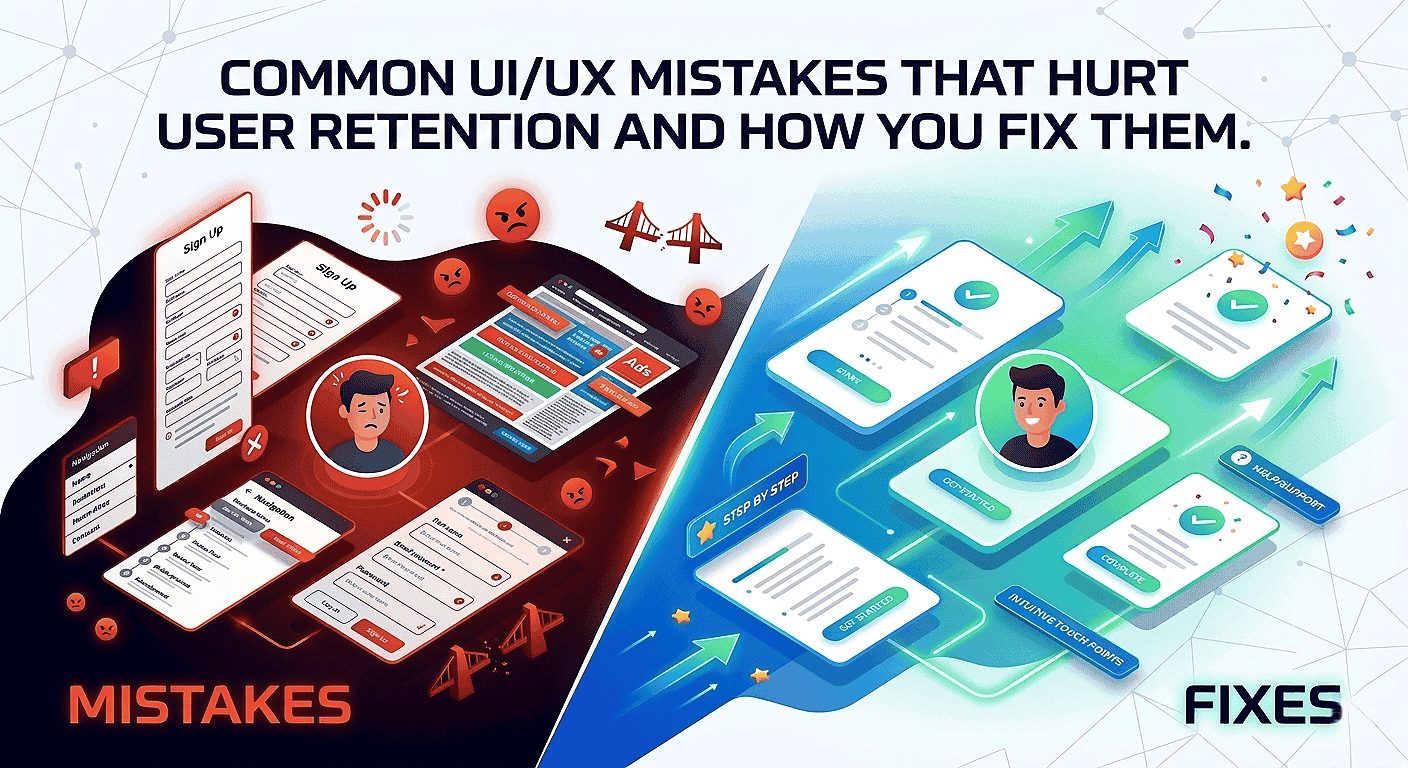
Tiny roadblocks in your product can add up to large drops in repeat visits. Below are the most common mistakes in 2026 products, why they cause churn, and fast fixes you can apply this week to keep users coming back.
Overwhelming Onboarding And Slow Time-To-First-Value
Long setup flows delay the first reward moment. When users wait too long, the habit loop breaks and they don’t return.
Fix (owner: PM/Design, 2–3 days): Build a 2-step “first win” flow using progressive disclosure. Ship behind a feature flag and measure 7-day activation by cohort.
Cluttered Layouts, Inconsistent Patterns, And Unclear Navigation Labels
Inconsistent patterns force users to relearn interfaces. Poor information hierarchy increases cognitive load and reduces feature adoption.
Fix (owner: Design, 1 day): Run a consistency audit, standardize components in a design system, and simplify navigation labels (replace vague terms like “Resources” with intent-driven names).
Unhelpful Error Messages And Missing Feedback That Create Uncertainty
Vague errors and missing inline validation reduce trust, especially in forms and checkout flows.
Fix (owner: Design/Eng, half day): Add inline validation, actionable error messages, and aria-live confirmations for dynamic feedback.
Ignoring Feedback Loops And Shipping Without Validation
Shipping without data risks scaling the wrong solution. Surveys, interviews, session replays, and funnel analysis reveal the real causes of churn.
Fix (owner: Analytics/Product, 3–5 days): Pair a short exit survey (3 questions) with 20 session replays and run rapid prototype tests before development.
Action Plan (This Week)
Create a 2-step “first win” path, run an A/B test, measure 7-day activation.
Run a component and label audit across the top 3 flows and log inconsistencies.
Replace vague errors with actionable microcopy and add inline validation to one high-traffic form.
Deploy a short exit survey, review 20 session replays, and prioritize fixes for the next sprint.
Before / After Microcopy Examples
-
Before (vague): “Error occurred”
After (actionable): “Card declined — try a different card or contact support at
[email protected]“
-
Before (vague): “Invalid input”
After (actionable): “Password must be 8+ characters and include a number.” - Resume banner example: “You were editing — resume where you left off”
Avoid dark patterns: Do not use misleading urgency, opt-out traps, or hidden fees. These may produce short-term lifts but damage long-term trust and retention—and increase legal risk.
Quick tip: Prioritize the biggest cognitive leaks first. Navigation, onboarding, and feedback often deliver the highest impact. After fixing a flow, track cohort retention to validate results and iterate.
High-Performing Vs Poor UX Patterns: A Quick Comparison Checklist
Use this quick checklist to audit key flows in minutes, identify fixes that improve engagement and user retention, and track the right metric for each change.
Navigation And Information Architecture That Guide Vs Confuse
Good: Clear labels, predictable paths, shallow menus.
Metric: Task completion time and 7-day retention.
Bad: Deep menus and ambiguous naming.
Onboarding And Activation That Convert Vs Drop Users
Good: Progressive first-win flow.
Metric: Activation rate (day 1 and day 7 cohorts).
Bad: Long tours and forced steps.
Microcopy, Feedback, And Trust That Reassure Vs Frustrate
Good: Actionable hints and instant feedback (e.g., “Saved — view in Dashboard”).
Metric: Form conversion rate and support tickets.
Bad: Vague messages and silent failures.
“Fix the biggest cognitive leaks first—navigation, feedback, and trust often pay the highest dividends.”
Fast audit method: Do a 5-minute walkthrough with a product manager and designer using this checklist. Capture three issues, assign one quick fix, and run a one-week test.
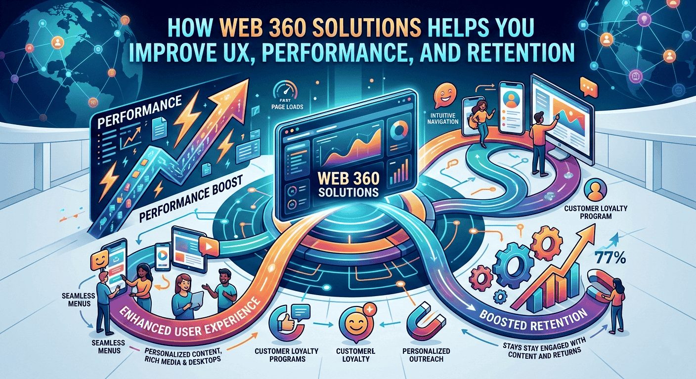
How Webo 360 Solutions Helps You Improve UX Performance And Retention
Webo 360 Solutions turns data into a clear roadmap so you can fix the exact points that drive churn across your user journey. Our evidence-based process starts with measurement, validates improvements through prototypes and testing, and delivers measurable outcomes for product teams.
UX Audits To Find Friction Across Your User Journey
We run focused UX audits for SaaS, mobile apps, and eCommerce platforms, combining heuristics, funnel analysis, accessibility checks, and session replay. These audits uncover onboarding drop-offs, confusing navigation, and conversion blockers. The result is a prioritized roadmap tied to retention metrics that your team can act on immediately.
Rapid Prototyping And Testing To Validate Improvements Before Development
We build clickable prototypes in tools like Figma or UXPin and run short usability tests with real users. This approach validates that changes reduce friction, connects qualitative feedback with quantitative data, and saves engineering time by ensuring you ship improvements that move key metrics.
Design Systems That Scale Consistent, Accessible Experiences Across Products
Our design systems provide consistent, accessible components that reduce UI drift, minimize regressions, and preserve UX gains over time. A shared system accelerates delivery and aligns design, product, and engineering teams.
- Process: Audit → prototype & test → implement with a design system.
- Outcomes: Higher activation, fewer drop-offs, and improved retention and engagement metrics.
3-step timeline (example): Week 0 — instrument core flows and baseline DAU; Week 2 — prototype and test a prioritized fix; Week 6 — ship a small change and measure cohort lift.
“Audit first, validate next, then scale with a system that preserves gains.”
Conclusion
Summing up: The six strategies—habit psychology, micro-interactions, personalization, mobile-first flows, accessibility, and performance optimization—create an experience users return to because it feels valuable, fast, and reliable.
Start with measurement: instrument retention metrics, map key drop-off points, and test clear hypotheses before changing content or flows. Focus on one high-impact flow, implement 1–2 targeted improvements, and track results in your retention dashboard.
If you prefer a structured roadmap, begin with a UX audit and retention strategy session to identify your highest-impact opportunities.
Adopt a simple weekly cadence: review cohort trends, analyze session replays, prioritize 1–2 fixes, and ship small improvements. Value is the engine—the faster users reach meaningful outcomes, the more likely they are to return.
3-Step Sample Sprint (2 Weeks)
If you want a structured, data-backed approach to improving engagement and retention, start with a focused UX retention audit.
At Webo 360 Solutions, we analyze onboarding flows, friction points, performance gaps, and behavioral data to identify the highest-impact improvements—directly tied to retention metrics.
Book a Free 30-Minute UX Retention Audit and get a prioritized roadmap tailored to your product.
Reminder: Privacy-first personalization and voice & gesture controls are key UX trends in 2026—consider them when planning pilots (see the Personalization and Mobile-first sections).
Frequently asked Question
What UI/UX design practices most effectively increase user engagement and retention in 2026?
Why should engagement and retention be your North Star metrics?
What does retention mean in a SaaS, mobile app, or eCommerce product?
Why does reducing UX friction often outperform adding new features?
What metrics should high-performing product teams track to improve retention?
What are realistic retention benchmarks in 2026?
How do I measure the ROI of UX improvements?
(ΔRetention × ARPU × average customer lifespan) − implementation cost.
Track cohort-based retention before and after UX changes, measure shifts in ARPU, and monitor support cost reductions to estimate the true financial return.