Responsive Web Design: How to Create a Responsive Website
53.42% of global web traffic came from mobile devices in Q2 2022, and 57% of users say they won’t recommend a business with a poorly made mobile site.
Those figures underline a simple business fact: your website must work well on phones and tablets or you risk losing visitors, rankings, and conversions. This guide explains responsive web design in clear terms and shows practical steps for responsive website development that improve user experience and search visibility.

In practice, a responsive website adapts layout, images, text, and navigation to each screen so visitors don’t need to pinch-zoom or scroll horizontally. That improves the experience on mobile devices and desktop alike and reduces maintenance compared with separate mobile and desktop codebases.
What you’ll learn in this article: a short roadmap—plan mobile-first, set the viewport correctly, build fluid layouts with Flexbox or CSS Grid, serve responsive images with srcset and sizes, and use targeted media queries to adapt elements across screen sizes.
Practical benchmark: aim for a First Contentful Paint under 2s on a typical mobile connection and keep touch targets roomy to improve conversions on smaller screens.
Key Takeaways
- You’ll understand how responsive web design makes pages adapt across screens and why that matters for SEO.
- Because most traffic now comes from mobile devices, mobile-friendliness directly affects user trust and search performance.
- Creating a single, responsive codebase reduces duplication and long-term costs versus maintaining separate sites.
- Optimizing images, using semantic HTML, and testing on real devices improves accessibility, performance, and user experience.
- Practical tactics include fluid grids (grid layout/Flexbox), sensible breakpoints, clamp-based typography, and touch-friendly controls.
What responsive web design is and why it matters today
Modern audiences interact from many devices and screen sizes, so layouts must shift to match each viewing context. Responsive web design is a design and development approach that lets pages adapt to a device’s screen size and capabilities so navigation, text, images, and controls remain usable and friction-free across desktop, tablet, and mobile devices.
Mobile usage and the business case
Mobile devices now drive the majority of visits—53.42% globally in Q2 2022—so a non-adaptive website risks higher bounce rates, lower conversions, and degraded brand perception on the channels where most users arrive.
Responsive website approaches give product and marketing teams a single codebase to maintain, which lowers development costs and reduces the chance of inconsistent experiences between platforms.
Google’s mobile-friendly ranking signal, mobile-first indexing, and SEO impact
Google began using mobile-friendliness as a ranking signal in 2015 and later moved toward mobile-first indexing, which evaluates pages primarily from a mobile user’s perspective. That means responsive web design and strong mobile performance help your pages compete in mobile search results.
Core Web Vitals and other mobile performance metrics now feed into search quality signals: faster, more stable pages typically correlate with better engagement and can influence search visibility. See the “Step-by-step” section for practical testing steps and anchors to measure Core Web Vitals.
- Lower costs: a single responsive codebase reduces maintenance and errors across devices.
- Better user experience: readable text, tappable controls, and faster paths to actions improve retention and conversion.
- Accessibility: semantic HTML and scalable elements make content easier to use with assistive tech.
- Performance: optimizing for cellular speeds and smaller screen sizes boosts engagement and lowers bounce.
| Benefit | Impact | Example |
| Conversion | +72% reported lift for adaptive design* | Checkout flows that fit small screens |
| Reach | 53.42% mobile traffic share | Content readable on tablets and phones |
| SEO | Higher mobile rankings when pages are mobile-friendly | Pages that pass mobile-friendly and Core Web Vitals checks |
Check original study context before citing: some “lift” figures come from controlled case studies rather than industry-wide benchmarks. For actionable steps, run the audit linked above and follow the Step-by-step build section to prioritize fixes.
Core principles: fluid grids, flexible images, and CSS media queries
Good layout begins with proportions, not fixed pixels. A fluid grid uses percentages or relative units so columns and containers scale with the viewport. That prevents horizontal scroll and keeps your content readable across screen sizes; use media queries to refine layout changes where content needs reflow.

Fluid and flexible grid layout basics
Modern layout systems like Flexbox and CSS Grid let items grow, shrink, and wrap. They replace fragile float-based approaches by offering alignment, ordering, and predictable wrapping as the width changes. Use CSS Grid for two-dimensional layouts (complex card grids or magazine-style pages) and Flexbox for one-dimensional components (nav bars, toolbars, simple card rows).
/* Simple responsive grid (CSS Grid) */
.container { display:grid; grid-template-columns: repeat(3, 1fr); gap:16px; }
@media (max-width:900px){ .container { grid-template-columns: repeat(2,1fr); } }
@media (max-width:600px){ .container { grid-template-columns: 1fr; } }
/* media queries adjust the grid layout based on screen size */
Making images and video adapt without breaking layouts
Set media rules such as max-width: 100% and height: auto so images and iframes scale to their containers. Use the <picture> element with srcset and sizes so the browser picks the best file for each device and pixel density, reducing bandwidth on smaller screens.
Media queries that respond to screen size and orientation
Write targeted media queries like @media (min-width: 768px) or @media (orientation: landscape) to adjust column counts, spacing, and typographic scale. Prefer content-driven breakpoints where elements naturally wrap instead of a fixed device list.
- Start fluid; enhance with queries only where content needs change — avoid overusing breakpoints.
- Place breakpoints where elements naturally wrap rather than by specific device models.
- Avoid deeply nested grids to reduce CSS weight and layout thrash on low-power devices; keep your css styles focused and modular.
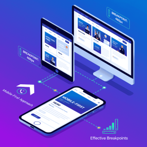
Mobile-first design and choosing effective breakpoints
Designing from the phone outward forces clear hierarchy and simpler layouts. A mobile-first workflow means you write base CSS for the smallest screens and then layer min-width media queries as the viewport grows. That approach keeps core content and actions prioritized on smaller screens and reduces overrides when you add styles for larger devices.
Why mobile-first simplifies scaling up
Mobile-first forces you to pick the essential elements, CTAs, and tap targets that matter most to users on mobile devices. By enhancing from a lean CSS baseline (min-width queries), you avoid undoing complex desktop rules and keep your stylesheets smaller and easier to maintain.
Practical tip: on small screens prioritize the primary CTA and core content in the source order so assistive technologies and search engines find them quickly.
Common breakpoints and when to customize
Canonical breakpoints—often used as starting points—include 576px, 768px, 992px, and 1200px. Treat these values as examples (Bootstrap-style) rather than rigid requirements: choose breakpoints where your layout actually needs to reflow.
- Place a breakpoint when a component visibly breaks or becomes cramped (for example, a three-column module wrapping awkwardly).
- Watch practical signals such as line length (ideal measure ~45–75 characters), tap-target size (aim for 44–48px minimum), and image aspect-ratio shifts to decide where to add a breakpoint.=
- Avoid hardcoding for specific devices—test across different screen sizes and record the widths where your design stops behaving.
Keep a small, documented set of breakpoints and rely on fluid behavior between them. That yields a predictable, maintainable approach to design responsive layouts that work across devices and different screen widths.
Mobile‑first checklist (quick):
- Prioritize top 1–2 CTAs for smallest screens
- Ensure touch targets ≥44px and clear spacing
- Verify content order matches user tasks
- Document breakpoints and why they exist
- Test in dev tools and at least two real devices
Setting the viewport meta tag for modern devices
The viewport meta tag aligns CSS pixels with the physical screen so your media queries and layout behave as intended.
Include this line in the head: <meta name=”viewport” content=”width=device-width, initial-scale=1.0″>. It instructs the browser to set the layout viewport to the device width and a sensible initial zoom, which makes responsive web layouts and media queries evaluate as you expect on mobile devices.
When the viewport tag is omitted, many phones render the page as if it were a full desktop width. The result is tiny, unreadable text, horizontal scroll, and forced pinch-zooming — issues that can hurt Core Web Vitals, accessibility, and user trust on mobile.
The viewport controls how media queries interpret breakpoints because queries read the layout viewport rather than the raw physical pixel grid. Place the meta tag early in your HTML <head> so CSS and scripts run against the correct width from the start.
/* Incorrect: no viewport — phones may render as desktop width */
/* Correct: set layout viewport to device width */
<meta name=”viewport” content=”width=device-width, initial-scale=1.0″>
- Use the standard tag as a safe default; do not disable user zoom (avoid user-scalable=no) to preserve accessibility.
- Test in iOS Safari and Chrome for Android to confirm text, images, and buttons are readable without pinch-zoom on common screen sizes.
- Treat the viewport as foundational: it must be present before other responsive design techniques behave as intended.
Quick diagnostic checklist: meta present in the <head>, no disabled zoom, verify breakpoints in dev tools and on at least two real mobile devices (one iOS, one Android).
Step-by-step: create a responsive website from scratch
Map primary tasks and CTAs for the smallest screen to guide every layout choice that follows. Begin by listing the core actions users must take (search, browse, buy, sign up). Prioritize those items so they appear first on smaller screens and in the document source—this helps both users and search engines find the most important content quickly.
Before writing css, sketch simple phone and tablet wireframes to verify navigation, spacing, and content order. Early wireframes keep markup lean and focus your grid layout and component decisions on the most important content and navigation elements.
- Build a fluid layout: use Flexbox or CSS Grid so cards, headers, and sidebars wrap naturally. A grid layout prevents fixed widths from breaking on different screen sizes and makes it easier to adapt components across devices. Example (CSS Grid): .cols{display:grid;grid-template-columns:repeat(3,1fr);gap:16px}
- Set breakpoints: add media queries only when content needs change—long paragraphs, cramped columns, or a menu switch. Prefer content-driven breakpoints where a component visibly wraps rather than device-based rules. Example: @media (max-width:900px){.cols{grid-template-columns:repeat(2,1fr)}}
- Optimize media: use max-width:100%, modern formats, and srcset/sizes so the browser picks the best image for each screen size and pixel density. Wrap video in a ratio container to preserve aspect ratio and avoid layout shifts. Example: <img srcset=”img-400.jpg 400w, img-800.jpg 800w” sizes=”(max-width:600px) 100vw, 50vw”>
- Scale typography: set base sizes in rem and use clamp() to cap growth so headings remain readable from phone to desktop. Example clamp: h1{font-size:clamp(1.25rem,3.5vw,2.5rem)}
- Test and iterate: resize in dev tools and then check flows on real devices or a cloud lab like BrowserStack to catch device-specific quirks. Include keyboard and aria checks during iteration so interactive components remain accessible.
As you refine, check touch targets (aim for ≥44px), sufficient contrast, and comfortable spacing. Iterate quickly: adjust breakpoints where elements first look cramped, fine-tune css styles to avoid specificity battles, and compress assets until the layout feels polished across devices and smaller screens.
Download the Responsive Launch Checklist — a printable checklist to guide your first round of tests and fixes.
Designing responsive navigation and menus that work across devices
Navigation and menus must scale so visitors find core actions fast on a large desktop monitor or a small phone screen. Good responsive navigation keeps primary actions visible, preserves clear labels, and uses roomy touch targets so users can get where they need without friction.

Desktop interfaces often use expanded or mega-menus to surface categories and rich content. On smaller screens, convert these heavy panels into off-canvas drawers, accordions, or a compact hamburger menu to reduce cognitive load while preserving wayfinding.
Practical patterns:
- Use a mega-menu on desktop only when users need quick access to many categories; convert it to an off-canvas drawer or accordion on phones to simplify the layout.
- Keep primary actions visible (search, account, primary CTA) and hide secondary links behind expandable controls to implement progressive disclosure effectively.
- Make nav items large enough for touch with clear visual states — aim for roomy tap targets (≈44–48px) and adequate spacing between items.
- Scale the header: move utility links into the menu, keep logo and search compact, and consider a reduced sticky header on mobile to avoid hiding content on short screens.
Accessibility and keyboard focus
Test keyboard and screen reader flows so focus moves predictably when drawers open and close. When opening an off-canvas menu, set focus to the first interactive item inside and return focus to the menu toggle when closing. Announce state changes with ARIA attributes (for example, aria-expanded on the toggle and aria-hidden on the panel).
<button id=”menuToggle” aria-expanded=”false” aria-controls=”navDrawer”>Menu</button>
<nav id=”navDrawer” aria-hidden=”true”>…menu items…</nav>
/* On open: set aria-expanded=”true”, aria-hidden=”false”, move focus into nav; trap focus while open */
Measure and iterate
Use analytics and quick A/B tests to measure the impact of menu changes on task completion and CTA clicks (for example, compare click-through rate on the primary CTA with the drawer vs. a visible top-level link). Monitor interaction metrics across different devices and refine the information architecture to reduce menu bloat and improve findability.
Implementation tips
- Prefer lightweight, well-documented components or small utility libraries — they usually outperform heavy framework widgets on mobile devices.
- Ensure visible focus styles for keyboard users and test with screen readers to confirm announcements and focus order are logical.
- Keep touch targets and spacing consistent across breakpoints and document the navigation component in your design system so it behaves predictably on different devices.
Typography that scales: rem, clamp, and viewport-based units
Scaling text correctly keeps your content legible from small phones to wide desktop displays. Start by setting a clear root font size so body and heading sizes use rem units. Relative units respect user preferences (browser font-size settings) and make scaling predictable across different devices and screen sizes.
Use clamp(min, fluid, max) for headings so type grows with the viewport but never becomes unreadable. Combine a fluid value using vw with fixed limits to avoid extremes and preserve hierarchy as the layout expands.
/* Responsive typography examples */
html { font-size:16px; } /* base for rem calculations */
p { font-size:1rem; line-height:1.6; max-width:60ch; } /* readable measure */
h1 { font-size:clamp(1.25rem, 3.5vw, 2.5rem); } /* min, fluid, max */
Reserve media queries for cases where fluid sizing cannot keep an optimal measure or hierarchy (for instance, very long headlines or large hero typography). Tune line-height, letter-spacing, and max-width so paragraphs remain comfortable on both smaller screens and large displays.
- Set base sizes in rem and scale headings with clamp for smooth, fluid growth.
- Use vw for subtle fluid steps and apply media queries only at logical breakpoints where content layout changes.
- Adjust spacing tokens for margins and padding so text blocks breathe across sizes and do not crowd adjacent elements.
- Test with real users and on real devices to confirm navigation labels, buttons, and body copy stay readable without zoom.
Typography QA checklist:
- Legibility: body text readable at default zoom on common mobile devices
- Contrast: meets WCAG AA for normal text
- Scaling: headings use clamp() or tested breakpoints
- Measure: paragraph max-width between ~45–75 characters for comfortable reading
- Accessibility: do not disable zoom; respect user font preferences
Responsive images and video: srcset, sizes, and aspect ratios
Treat images and videos as critical assets that must load fast and keep layout stable. Serve media that matches the viewer’s device, viewport, and connection so pages paint quickly and avoid layout jumps that frustrate users.
Performance-first image strategies for smaller screens
Use srcset with width descriptors and a sensible sizes attribute so the browser picks the best file for the current screen size and pixel density. Combine this with modern formats (WebP/AVIF) and JPEG/PNG fallbacks to balance quality and bandwidth across devices.
Always apply max-width: 100% and height: auto to images and iframes so media scales to its container without breaking the grid. Reserve intrinsic space for media using width/height attributes or CSS aspect-ratio to reduce cumulative layout shift (CLS).
<picture>
<source type=”image/avif” srcset=”hero-400.avif 400w, hero-800.avif 800w” sizes=”(max-width:600px) 100vw, 50vw”>
<source type=”image/webp” srcset=”hero-400.webp 400w, hero-800.webp 800w” sizes=”(max-width:600px) 100vw, 50vw”>
<img src=”hero-800.jpg” srcset=”hero-400.jpg 400w, hero-800.jpg 800w” sizes=”(max-width:600px) 100vw, 50vw” alt=”Hero image” style=”max-width:100%;height:auto;”>
</picture>
- Lazy-load below-the-fold images (native loading=”lazy”) to speed initial render on slow networks but avoid lazy-loading critical above-the-fold assets.
- Define art-direction breakpoints to swap differently cropped assets when layout slots change (for example, wide hero → tall mobile crop).
- Reserve space (width × height attributes or CSS aspect-ratio) to prevent layout shifts when images load.
Maintaining video aspect ratios across screen sizes
Wrap embeds in a responsive ratio container (or use CSS aspect-ratio where supported). The classic CSS pattern uses a wrapper with padding-bottom (56.25% for 16:9) and absolutely positions the iframe inside so the player scales without distortion.
/* Ratio wrapper for 16:9 video */
.video-wrap{position:relative;width:100%;padding-bottom:56.25%}
.video-wrap iframe{position:absolute;top:0;left:0;width:100%;height:100%}
Use low-res poster images for initial paint, set max-width:100%, and defer heavy players until the user interacts or the element is near the viewport (intersection observer) to avoid loading large third-party scripts on small screens.
Practical asset workflow
Automate derivative generation (multiple widths and formats) in your build pipeline or at the CDN edge. Name files clearly (hero-400.webp, hero-800.jpg), and document which sizes map to common layout slots so designers and engineers produce consistent variants.
| Technique | Why it helps | Quick example |
| srcset + sizes | Delivers optimal file by width and density | <img srcset=”img-400.jpg 400w, img-800.jpg 800w” sizes=”(max-width:600px) 100vw, 50vw”> |
| WebP/AVIF with fallback | Smaller files at similar quality | <picture> with source type=”image/webp” then img fallback |
| Ratio wrapper for video | Keeps framing stable across widths | Container with padding-bottom:56.25% + absolute iframe |
| Lazy loading & preload | Speeds initial paint; improves perceived performance | Use loading=”lazy” for below-the-fold; rel=”preload” for hero images |
Test images and clips on real devices and varied networks. Measure CLS and LCP across breakpoints, and document your asset pipeline so teams produce consistent images that let your responsive design adapt to different screens while keeping content crisp and stable.
Frameworks and utilities to speed up builds
Picking the right framework or utility library speeds delivery and shapes how your layouts scale across screen sizes. The choice affects development speed, payload size, and how easily you prototype navigation, grids, and core components for a responsive website.
Bootstrap is reliable for rapid prototyping: it provides a robust grid, predefined breakpoints, and many ready-made components that accelerate implementation. For teams that need opinionated components and quick results, Bootstrap reduces initial build time.
Bootstrap and Foundation for component-rich projects
Foundation emphasizes accessibility and Sass mixins, making it useful when you need flexible grids and advanced responsive UI patterns (off-canvas menus, complex toolbars) with built-in behaviors.
Tailwind CSS and utility-first responsive variants
Tailwind CSS offers precise control through utility classes and responsive variants in markup. It encourages composable patterns, lets you avoid large custom stylesheets, and — when configured correctly — can be purged to include only the utility classes you use, keeping payloads small for mobile devices.
When a lightweight approach like Pure CSS is enough
For small marketing sites or single-page projects, a minimal CSS kit or handcrafted styles often wins. If performance and low complexity are top priorities, avoid heavy framework defaults and keep CSS focused on the components you actually need.
Decision matrix — which approach to choose
- Large product or enterprise: component library (Bootstrap/Foundation) + design system.
- Design-driven product with small bundle goal: Tailwind CSS (utility-first) with purge/Tree-shaking.
- Small brochure site: lightweight Pure CSS or custom, performance-first styles.
Optimization and build tips
- Trim unused styles: enable PurgeCSS / Tailwind purge or use a build step to remove unused CSS rules.
- Extract critical CSS: inline the minimal CSS needed for above-the-fold content and defer the rest to reduce render-blocking.
- Defer nonessential JS: load interactive components after the first meaningful paint and lazy-init heavy widgets on user interaction.
- Compress and serve modern image formats: reduce asset weight across devices and screen sizes.
Document your chosen conventions breakpoints, utility classes, and component APIs — so future contributors follow the same responsive patterns. Well-documented choices help maintain consistent css styles and speed up handoffs between design and engineering.
Responsive website development: Tools, Workflows, and Handoff
Good tooling and crisp documentation make it far easier to turn design frames into production-ready pages. Begin by agreeing on a shared component library so elements resize predictably and the team avoids duplicated effort when implementing a responsive website.
Prototype with intent: create Figma frames for common widths and use Auto Layout and constraints so components reposition predictably. Annotate breakpoints, spacing tokens, and typography scales so developers can map designs directly to maintainable CSS and media queries.
Prototyping and developer handoff considerations
Use Dev Mode and selective plugins—for example, Locofy, Anima, or Builder.io—to generate starter code, but always review exports for semantic HTML, accessible markup, and performance before merging into the repo. Auto-generated code is a helpful starting point, not a final solution.
- Document media queries, naming conventions, and component constraints so styles remain discoverable and consistent across screen sizes and devices.
- Keep a checklist for hover, focus, active, and touch states and verify each interactive component across pointer and touch input.
- Capture edge cases with real content and images (long labels, translated text, empty states) to avoid surprises at runtime.
| Step | Why it helps | Example |
| Shared component library | Reduces visual drift and speeds implementation | Buttons, cards, headers with spacing tokens and constraints |
| Codegen + review | Speeds handoff while preserving quality | Run Locofy, then hand-review DOM, semantics, and aria labels |
| Design QA cycles | Catch runtime and performance issues | Test on real devices and validate Core Web Vitals |
Handoff checklist (quick)
- Design tokens: colors, spacing, breakpoints, typography scales
- Component variants: mobile/desktop states, disabled states, translatable labels
- Accessibility: aria roles, focus order, visible focus styles
- Performance notes: critical CSS, preloaded hero assets, lazy-load rules
- Testing matrix: list of devices/widths and target Web Vitals thresholds
Recommend a small PR template for design QA that includes the device-test matrix, screenshots at key widths, and a short note on Core Web Vitals results for the changes. Coordinate with engineers on performance budgets and critical CSS extraction, and archive decisions (why a breakpoint exists, why a pattern was chosen) so future contributors onboard quickly and the responsive design remains consistent across devices.
Need a ready-made handoff checklist? Download the handoff checklist template to standardize your workflows and speed developer handoff.
Testing across different screen sizes and real devices
Quick checks in the browser catch many issues, but real devices reveal the rest. Start testing early so layout, touch, accessibility, and performance problems surface before release. Build a simple device-and-width matrix so you consistently cover common screen sizes and different devices during QA.
Using responsive mode in dev tools
Open Chrome DevTools’ responsive mode (or Safari/Edge equivalents) to resize viewports, emulate touch, and validate media queries. Use these tools to find the breakpoints where elements wrap, overlap, or otherwise break.
- Resize: Drag widths to discover exact points where columns collapse or content reflows—note those widths as candidate breakpoints.
- Touch: Enable touch emulation to check tap targets, gestures, and touch-only controls.
- CSS checks: Inspect for overlapping elements, clipped text, images overflowing containers, and unexpected scrollbars.
Real device and browser cloud testing best practices
After dev-tool checks, run Google’s Mobile‑Friendly Test to confirm basic render and indexing signals, then validate flows on real hardware or a cloud lab such as BrowserStack to catch OS‑browser quirks and performance differences across devices.
- Prioritize critical user flows in your test plan: navigation, search, forms, and checkout. Verify these on phones, tablets, and at least one desktop browser.
- Measure load and interaction latency and prioritize fixes that improve First Contentful Paint (FCP), Largest Contentful Paint (LCP), and input responsiveness (INP/FID).
- Capture screenshots, device logs, and exact viewport widths where issues occur. Retest after fixes and add regression checks to your release process.
| Tool | What to check | When to use |
| DevTools (responsive mode) | Viewports, media queries, quick layout checks | During development and early QA |
| Google Mobile‑Friendly Test | Render, crawlability, basic mobile signals | Pre-launch QA |
| Browser cloud / Real devices | Rendering differences, touch, performance, accessibility | Final verification and regression testing |
Device-width matrix example (start simple):
Device / Width | Example device
———————|—————-
Small phone (360px) | Android small phones
Medium phone (412px) | Pixel / Galaxy standard
Large phone (768px) | Phablet / small tablet
Tablet (1024px) | iPad / tablet landscape
Desktop (1366px+) | Common laptop/desktop
Keep a living matrix of tested widths and devices and schedule periodic audits as content changes. Document issues, link them to the exact viewport where they appear, and include remediation steps so your responsive website remains reliable for users across screen sizes and devices.
Performance for responsiveness: speed, images, and render path
Performance choices determine whether your design feels instant or laggy on different devices. Fast pages keep users engaged and improve conversions; slower loads increase abandonment. (Verify any bounce‑rate statistics you cite for your audience before publishing.)
Prioritize the first meaningful paint and perceived performance. Reduce CSS that blocks the critical rendering path, defer nonessential JavaScript, inline only the truly critical CSS for above‑the‑fold content, and preload key resources (fonts, hero images) so the page paints quickly and avoids layout shifts.
Minimizing CSS/JS bloat and avoiding render-blocking
Optimize images and serve modern formats so smaller screens and constrained networks download the smallest appropriate assets. Use srcset and sizes to let browsers select the right image for the current screen size. Apply code‑splitting, tree‑shaking, and CSS purging to remove unused rules from frameworks and reduce payloads for mobile devices.
- Inline a minimal critical CSS bundle for above‑the‑fold UI and defer noncritical styles to reduce first paint time.
- Preload essential fonts and hero images with <link rel=”preload”> and use font-display: swap to avoid invisible text.
- Defer or async third‑party scripts; audit tag managers and ad libs that can slow initial interaction.
- Measure Web Vitals (LCP, FID/INP, CLS) and focus on the metrics that most affect mobile users’ experience.
- Build a repeatable workflow: automate image compression, run CSS purging in CI, and monitor real‑user metrics across breakpoints and content variations.
[H3] Performance recipe — five quick wins
- Optimize images in your build (e.g., sharp/Imagemin pipelines) and serve WebP/AVIF where supported.
- Use srcset/sizes so browsers pick appropriately sized images for each device.
- Inline critical CSS for above‑the‑fold content and defer the rest (tools: Critical, Penthouse).
- Lazy‑load offscreen images and defer heavy players until interaction (Intersection Observer).
- Audit and defer third‑party scripts; prefer async loading and tag management that supports performance budgets.
How to measure
Use Lighthouse for lab audits and Real User Monitoring (RUM) to capture actual performance across users and devices. Track First Contentful Paint and Largest Contentful Paint for load perception and INP/FID for interactivity. Export timelines and group by device and connection to prioritize fixes that benefit real users on smaller screens and slower networks.
Quick action: run a free page speed check with Lighthouse or PageSpeed Insights to get prioritized recommendations and a starting list for fixes.
Accessibility benefits baked into responsive design
Design choices that scale across screens also improve access for people using assistive technology.
Start with semantic HTML so headings, landmarks, and controls are explicit to screen readers and voice tools. Proper structure allows users to skip to main content, understand page hierarchy, and navigate without guessing.
Keep keyboard focus visible and predictable. When implementing off-canvas menus or accordions, move focus into the panel on open, trap focus while it’s open, and return focus to the triggering control on close so keyboard users can follow the flow.
Size targets and preserve user control: make touch targets roomy and maintain consistent spacing so people with motor challenges can tap accurately. Do not lock zoom — allow users to scale text and respect their browser preferences.
- Provide clear, descriptive alt text for images and captions for media so non-visual users receive the same information.
- Label form fields and controls so assistive tech announces their purpose; use <label>, aria-label, or aria-labelledby as appropriate.
- Maintain sufficient contrast and legible text sizes across themes and breakpoints to help users with low vision.
- Test with screen readers (NVDA, VoiceOver) and voice control to confirm interactive elements announce state and purpose.
| Focus area | Why it matters | Quick action |
| Semantic HTML | Helps screen readers parse content | Use landmarks (<main>, <nav>), proper headings, and ARIA only where necessary |
| Keyboard & focus | Enables navigation without a mouse | Ensure visible focus styles, logical tab order, and focus management for dialogs/drawers |
| Touch targets & text | Improves usability on small devices | Follow touch-size guidelines (≈44–48px recommended), allow zoom, and ensure readable line lengths |
Treat accessibility as a core part of design and code, not a late checklist. Document accessible patterns for navigation and interactive elements, include accessibility checks in QA cycles, and collect real user feedback to continue improving the experience for all users on different devices and screen sizes.
Resources: consult WCAG success criteria and the ARIA Authoring Practices for details on contrast ratios, focus management, and recommended touch target sizes.
Practical examples: how leading sites adapt layouts
Concrete examples make it easier to spot when your content needs a different layout. Below are concise examples you can model and test against your own pages — focusing on images, CTAs, and layout choices that work well across devices.
Airbnb — image-driven browsing
Airbnb scales image grids and cards so listings remain immersive on both small and wide screens. Cards reflow from multi-column to single-column while keeping photos large and tappable, so browsing feels visual and fast on mobile devices.
- What to copy: prominent images that resize with the grid, tactile card spacing, and single-column feed on phones.
- What to avoid: forcing fixed image heights that crop important content or cause layout shifts when images load.
Patagonia — streamlined commerce and CTAs
Patagonia collapses complex navigation into a clear hamburger on phones and keeps primary purchase CTAs visible in context. This reduces friction on smaller screens and helps conversion without overloading the header.
- What to copy: visible primary CTA placement and simplified mobile checkout flows.
- What to avoid: burying the primary action behind secondary navigation or oversized hero assets that push CTAs off-screen.
The Washington Post, Apple, and Dropbox
The Washington Post reduces density on small screens, often switching to a single column and lightweight scrollers for category lists. Apple prioritizes clarity and consistent media scaling, tucking secondary links into expandable menus. Dropbox uses a fluid grid that adapts icons, illustrations, and text while swapping to a drawer-style menu on mobile.
- Common patterns: card grids that collapse to stacked content, off-canvas navigation for phones, and prominent CTAs that remain visible across breakpoints.
- Watch where columns drop — that often marks a natural breakpoint for your layout and when to swap images or reduce density.
- Swap lighter assets for mobile devices (lower-resolution images or smaller illustrations) to keep load times low and interactions snappy.
| Brand | Key move | Why it helps |
| Airbnb | Scale image grid | Keeps browsing immersive and tappable across screen sizes |
| Patagonia | Hamburger menu + visible primary CTAs | Simplifies shopping and improves conversion on phones |
| Dropbox | Fluid grid + drawer menu | Preserves layout clarity and reduces clutter on small screens |
Mini A/B test idea: select a product or listing page and test two variants on mobile — Variant A keeps the primary CTA in the header; Variant B moves it inline within content. Measure click-through and conversion rates to see which placement improves the funnel on smaller screens.
Actionable rule: test these examples against your pages, tune where columns drop, and swap media for different screen sizes so your responsive design keeps consistent polish and performance across devices.
Common pitfalls and how to troubleshoot them
Small layout faults often become big problems when the viewport changes. Diagnose issues by reproducing them across a range of widths so you know the exact breakpoints and conditions that trigger the problem. Work from symptoms to root cause: rendering oddities usually stem from fixed sizes, stacking context, or unexpected CSS specificity.
Overlapping elements, cut-off text, and oversized media
Symptoms: images overflow containers, headings get clipped, or buttons hide behind other blocks as the viewport narrows.
- Prefer flexible media: ensure images and media use max-width: 100% and avoid fixed heights that clip text or crop content unexpectedly.
- Replace hard pixel widths with percentages, rem, or clamp() so content scales with the container rather than the viewport.
- Avoid absolute positioning for core content where possible; absolute elements often create stacking context and overlap issues when other elements reflow.
/* Common fix: make a sidebar collapse under content instead of overlapping */
.sidebar{width:300px;float:right;} /* problem: overlaps on narrow screens */
/* better: responsive grid or flexbox */
.container{display:grid;grid-template-columns:1fr 300px;gap:16px}
@media(max-width:800px){ .container{grid-template-columns:1fr} /* sidebar flows below */ }
Breakpoint gaps and inconsistent spacing
Symptoms: areas feel cramped at some widths, spacing jumps between sizes, or elements appear unevenly spaced after a resize.
- Test incremental widths and insert a small media query where content first appears cramped—place breakpoints where layout components naturally reflow, not by device model.
- Normalize spacing with a token scale for margins and padding so components share a consistent rhythm across breakpoints.
- Centralize shared behaviors (base spacing, container widths) to reduce contradictory rules and cascade conflicts that cause unexpected jumps.
Debugging checklist (step-by-step)
- Reproduce the issue in DevTools and note the exact viewport width where it appears.
- Inspect computed sizes and box model for the affected elements to find fixed widths/heights.
- Temporarily toggle CSS rules to isolate which declaration causes overlap (position, z-index, width).
- Apply a flexible alternative (percent/rem/clamp or grid/flexbox) and retest at the problematic width and intermediate sizes.
- Verify on at least one real device and record the fix in your design patterns document to avoid regression.
Debug with browser dev tools: inspect computed sizes, toggle media queries, and trace which CSS rules apply. Confirm navigation and menus remain usable when labels grow or translate. Finally, test on real devices to catch vendor quirks and document patterns and fixes so regressions are less likely.
Save this troubleshooting checklist for your team: Download the troubleshooting checklist.
Conclusion
Finish strong: build a plan that keeps content readable and fast across every screen. A mobile-first approach, fluid layouts, sensible breakpoints, and optimized media form the core steps you must follow to deliver a reliable responsive design and better user experience on mobile devices and desktop alike.
Download the Responsive Launch Checklist
Three measurable next steps
- Run a mobile audit (use the free audit link above) and capture Core Web Vitals and key layout issues across your top pages.
- Prioritize the top 3 fixes that most improve First Contentful Paint, Largest Contentful Paint, and navigation on smaller screens.
- Schedule a two‑week QA cycle: implement fixes, test on real devices, and verify metrics improved in your RUM or Lighthouse runs.
Why it matters: mobile traffic and Google’s emphasis on mobile‑first signals make responsive design essential for reach, conversions, and search visibility. Thoughtful responsive website development also improves accessibility and user trust, reducing friction for users across devices and screen sizes.
Test on emulators and real devices, measure performance and user metrics, document patterns, and choose tools that speed delivery without adding weight. With these habits you can create responsive experiences that work across devices and screens and deliver measurable results.
Frequently Asked Questions
What is responsive web design and why does it matter today?
Responsive web design is the practice of building pages that adapt their layout, images, and controls to different screen sizes and device capabilities. It matters because most users now browse on mobile devices and tablets; making your website responsive improves engagement, conversions, accessibility, and search visibility.
How does mobile usage affect your business case for adaptive layouts?
Mobile traffic frequently represents a large portion of visits and conversions. Designing for smaller screens first forces you to prioritize content and performance, which reduces friction for users on cellular networks and can improve retention and revenue.
Does Google favor mobile-friendly pages for rankings?
Yes. Google uses mobile-friendliness and mobile-first indexing as part of its ranking considerations. Pages that render and perform well on phones and tablets are more likely to perform better in mobile search results.
What are the core principles you should follow?
Follow a fluid grid layout, use flexible images and media, and apply CSS media queries at content-driven breakpoints. These principles let layouts scale, prevent media from breaking designs, and enable targeted adjustments by screen size or orientation.
How do fluid grids and flexible layouts work?
Fluid grids use relative units (percent, fr, rem) so columns and components resize with the viewport or container. CSS Grid and Flexbox give you predictable flow, alignment, and wrapping so content reflows without fixed widths that cause overflow.
How can you make images and videos adapt without breaking layouts?
Use max-width:100% and height:auto, supply multiple image sizes with srcset and sizes, and reserve intrinsic space with width/height attributes or CSS aspect-ratio. For video, wrap embeds in a responsive ratio container or use the aspect-ratio property.
What role do media queries play in adapting to screen size?
Media queries let you change styles at defined breakpoints (or by orientation, resolution, and other features). Use them to adjust column counts, spacing, typographic scale, and to swap navigation patterns so the interface fits each device category.
Why choose a mobile-first approach?
Mobile-first means authoring base styles for the smallest screens then enhancing for larger viewports. It keeps CSS simpler, prioritizes content and performance, and reduces the need for overriding desktop rules later.
What are common breakpoints and should you customize them?
Common example breakpoints are ~576px, 768px, 992px, and 1200px, but choose breakpoints based on where your content actually needs to reflow. Use analytics and responsive testing to find the widths where layouts break and document your choices.
How important is the viewport meta tag?
Very important. The viewport meta tag (<meta name=”viewport” content=”width=device-width, initial-scale=1.0″>) tells browsers to match the layout viewport to the device width so media queries and responsive layouts behave correctly on mobile devices.
What are the basic steps to create a responsive site from scratch?
Plan content hierarchy and core CTAs for small screens, wireframe phone and tablet layouts, implement a fluid grid with CSS Grid/Flexbox, add content-driven media queries, optimize images and fonts, and test across devices and screen sizes.
How should you plan navigation for different devices?
Keep primary navigation concise on mobile using a hamburger, accordion, or off‑canvas menu, and expand navigation on larger screens. Ensure touch targets are large enough and that keyboard and screen reader flows remain logical.
What techniques help typography scale across screens?
Use relative units such as rem, vw, and clamp() for headings and body text so type scales smoothly. Reserve media queries for cases where fluid scaling doesn’t maintain readable line lengths or hierarchy.
How do srcset and sizes help with responsive images?
srcset and sizes allow the browser to choose an appropriately sized image for the current layout width and device pixel ratio, reducing bandwidth on mobile devices and improving load times.
What performance strategies matter most for smaller screens?
Prioritize critical CSS, lazy-load offscreen images, compress and serve modern image formats, and avoid render-blocking scripts. Monitor Web Vitals and use real‑user metrics to prioritize fixes that help users on constrained networks and devices.
Which frameworks speed up building adaptable layouts?
Frameworks like Bootstrap and Foundation provide ready-made grids and components; Tailwind CSS enables utility-first responsive variants. For simple sites, a lightweight, custom CSS approach can minimize payloads and improve performance.
How do you handle prototyping and developer handoff?
Use design tools that support breakpoints and export specs (Figma, Figma Dev Mode). Provide style tokens, spacing scales, annotated breakpoints, and component variants so developers can implement media queries and responsive behaviors consistently.
What testing methods ensure layouts work across screens?
Use browser DevTools’ responsive mode for quick checks and cloud/device labs for broader coverage. Test critical flows (navigation, search, forms, checkout) on real devices and measure performance with Lighthouse and RUM.
How can you avoid common layout problems like overlapping elements?
Test at intermediate widths, prefer flexible units (%, rem, clamp), set min/max sizes, and centralize spacing tokens. Inspect breakpoints to catch gaps or cut-off content and adjust styles where needed, then document fixes to prevent regressions.
How does accessibility fit into adaptable design?
Semantic HTML, proper heading structure, keyboard navigation, and adequate contrast help assistive-tech users. Responsive approaches that prioritize content order and clarity improve access for all users across devices and screen sizes.
How can I measure responsive performance and prioritize fixes?
Measure with Lighthouse for lab tests and RUM for field data. Group results by device and connection, prioritize fixes that improve LCP and INP for high-traffic pages, and address issues that affect the largest number of users first.
Can you name real examples of sites that adapt well to different screens?
Companies like Airbnb, Patagonia, The Washington Post, Apple, and Dropbox use scalable layouts, prioritized navigation, and optimized media to deliver consistent experiences across devices.